
Fast-tracking prospects to a proposal
Lifting conversion rates by streamlining data collection.
7 minute read
Project DetailsWhen: 2015
Span: 6 Weeks
Where: Fidelity Investments
Role: Fidelity Go Design Director
My ContributionLed the discovery and exploration
Oversaw execution and measurement
Ensured strategic alignment
What I hope you take awayHow I take a team approach to exploring design solutions
How I pivot designs quickly based on user feedback
How I influence other roles for design success
BACKGROUNDFidelity Go is a simplified, digital-only investment offering targeting first time investors. Prospects provide information about themselves and their financial goals, and then Fidelity Go suggests a tailored investment strategy proposal. User data suggested that the number of questions, use of jargon and clinical presentation may be limiting the number of prospects getting to a proposal.
CHALLENGEHow might we increase the number of prospects that receive a proposal?
SOLUTIONGathering data, insights & observations
First, I took peek at the current conversion. Between the two call-to-action buttons on the landing zone page, 9.2% of visitors were making it to the profile page. Not bad, but then only 2.2% of the profiling population was actually viewing the proposal page. I knew we could do better.

MVP conversion funnel
Second, I kicked-off discovery by revisiting the genesis of the current profiling screen. Three considerations heavily shaped the minimal viable product (MVP) version:
A desire to collect information
The more Fidelity knows about a user, the better it can suggest an investment strategy suited for them.
Legacy position of legal
Government agencies regulate financial products; thus, legal resists straying from known, safe language and positioning.
It was quick & easy
Existing patterns and components existed which made design and development speedy for MVP.
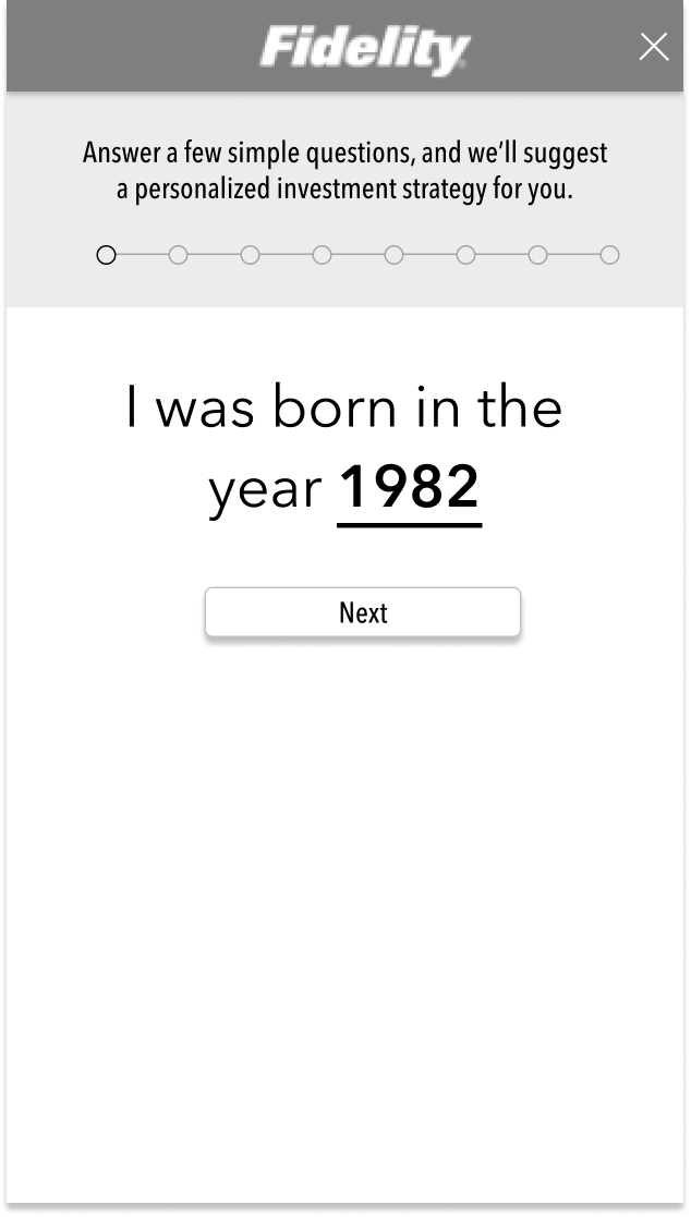
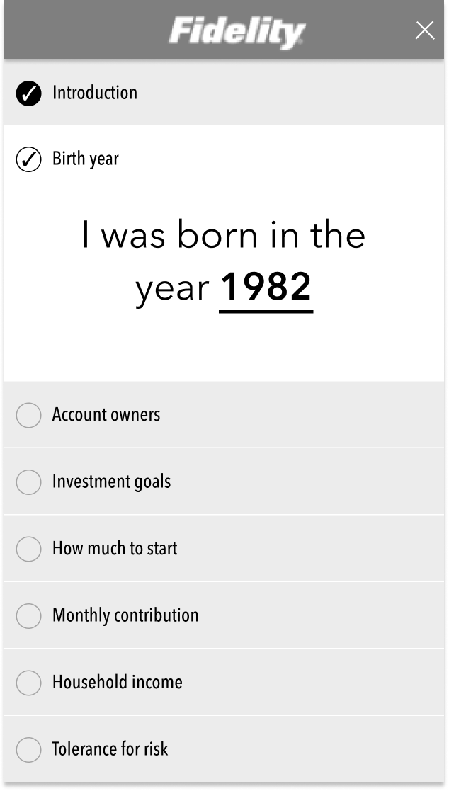
MVP Profiling screen
Then, I considered our primary (Trish) and secondary (Jennifer) personas:
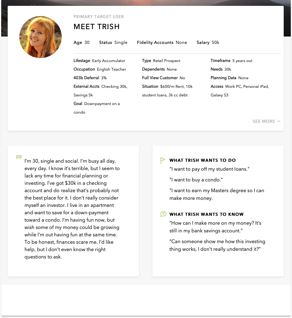
Primary “Trish” Persona
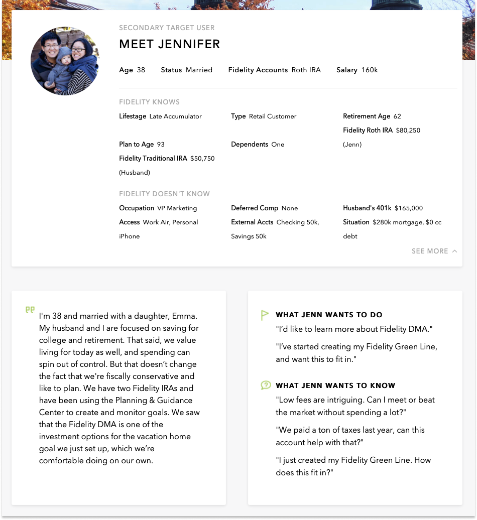
Secondary “Jennifer” persona
Lastly, I reviewed existing customer research and verbatims specific to the profiling page:


What Trish thought…
What Jennifer thought…
“Oh wow. I didn’t expect all this.”
“This risk tolerance question is paralyzing. Aren’t you the professionals? I’d expect you to tell me what it should be.”
“Wait - This is for first time investors, right? Why are you asking me about how I react to falling markets?”
“This [unexpected future expense] makes no sense. If I knew, it wouldn’t be unexpected.”
“Net worth? I wish.”
“See, I’m never gonna read all this [legalese]. It makes me feel like you’re hiding something.”
“Equity holdings? I have no idea what this mean.”
“Guess I would need to talk with a financial advisor to complete this.”
Generative interviews
To validate user sentiment and generate ideas, I worked with our user research partners to run a one-day user workshop. We invited a dozen representatives from our target customer population to come share impressions of the onboarding flow. After the interviews wrapped up, we used an affinity diagram to chunk insights into themes. I then led the product team through an exercise to develop a clear problem statement to frame our exploration.
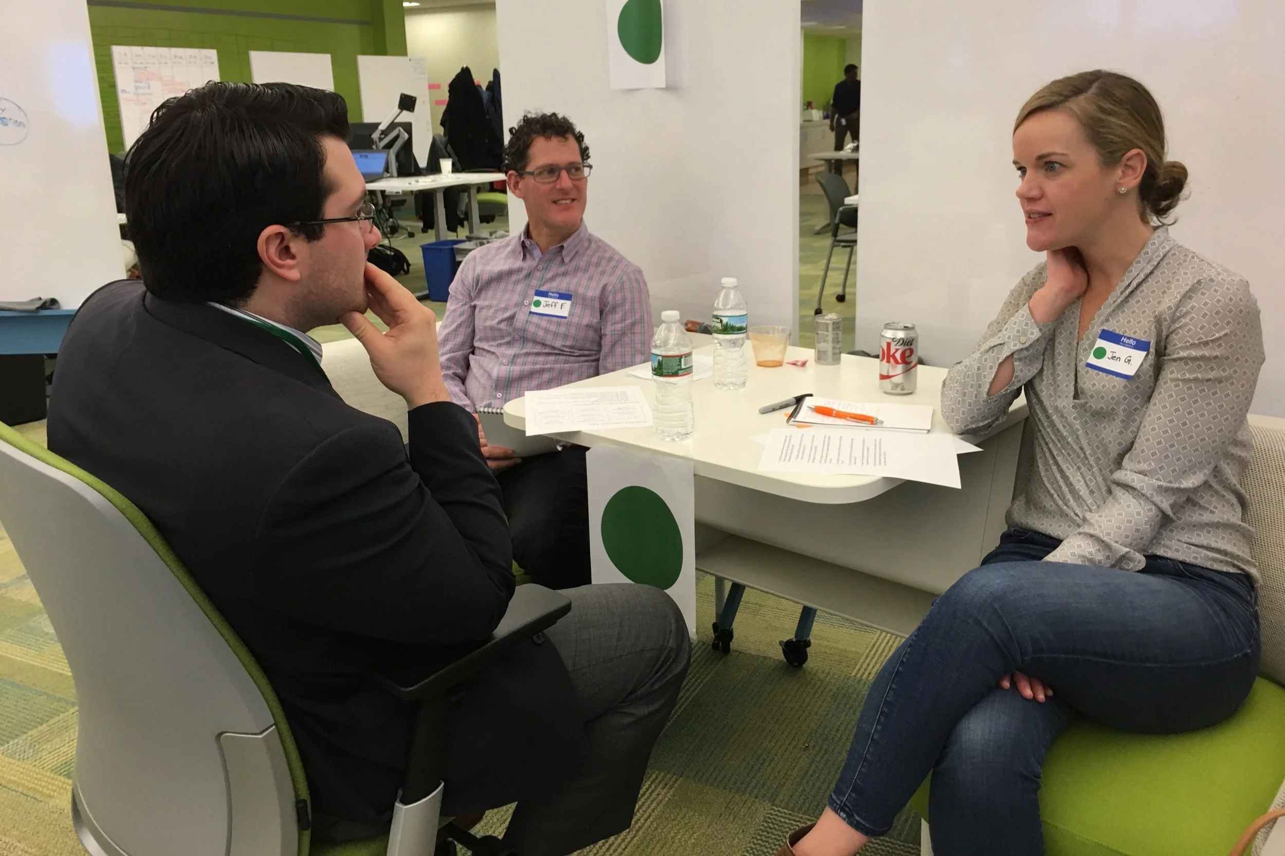
Interviewing a “Trish”
Affinity diagram of feedback
Project problem statement
Generating ideas
As the design lead for this project, my approach was to set the stage for the entire design team to explore solutions. Once ready, I held exploration sessions with the design team to generate and refine ideas:
First Session
We reviewed all discovery and the problem statement. I then led the team in an exercise to develop design principles.
Design principles
Second Session
Focused on generating ideas. Each designer was challenged with sketching three ideas to address the problem statement.
Exploratory sketches
Narrowing down ideas
My next step was to create three testable prototypes representing the best solutions. Once the ideas were clearly expressed, I consulted with our development lead for input on the technical effort and considerations of each design. Then, I worked with our user research partners to formulate and run an unmoderated, remote test to evaluate each design.
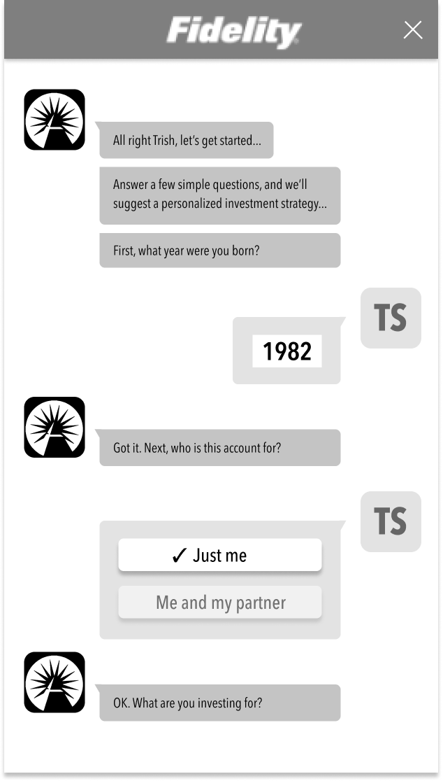
Option 1: Conversational
Option 2: Question-at-a-time
Option 3: Accordion
Selecting the champion idea
The final step of the exploration phase was to present the three most promising solutions, technical considerations, and user test results to project leadership for discussion. The second option, the single question, stood out as the clear favorite among users and the product team and was soon dubbed the “Quick Path Profile.”
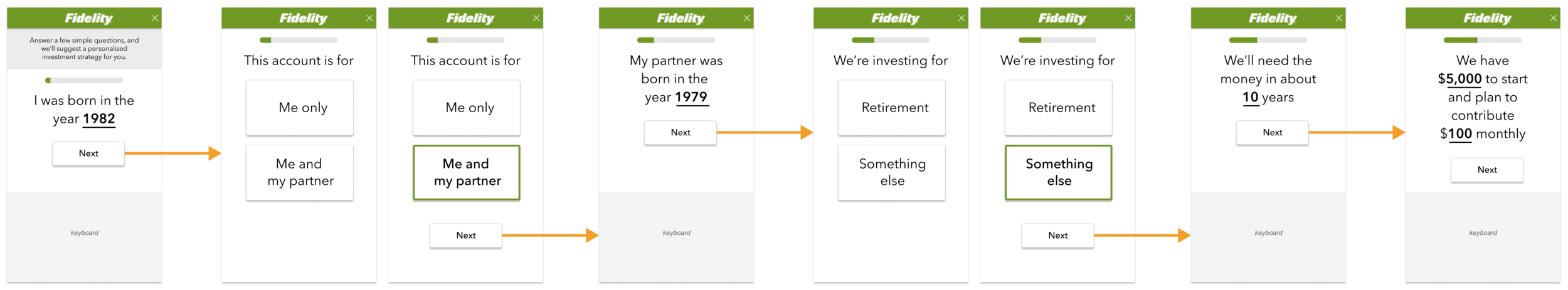
Quick Path Profile flow diagram
Appealing to legal
Typically, a product team would submit high-fidelity mock-ups of a proposed design to a generic legal inbox. House counsel would review the designs and reply with any objections or alterations in the form of a PDF. This back and forth was continued until both parties were satisfied (or one relented). We took a different approach:

Make counsel a member of the project team.
Counsel sat with the team and became intimately familiar with the inner workings and challenges of the effort.
Encouraged counsel to attend user testing sessions first-hand.
Observing the target audience struggle with complex, financial, and legal language was powerful in making a case for change.

Consult counsel early and often throughout the process.
Frequent exposure to design helped avoid legal missteps while helping counsel to understand the how and why behind the design.
Altogether, by having counsel fully present and working with the team, the project was able to produce a new product aimed at a new audience within the comfort zone of our legal partners.
Detailed design & build
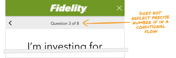
Once we had a production candidate, the team conducted a lab study to validate the solution. One of the tricky design details we needed to sort out was how to indicate the user’s location and progress in the flow. For this test, we used a simple “Question X of Y” to display progress. Although this approach was straightforward, it was imprecise since the total number of questions can vary. For example, if a user indicated the account was for both them and a partner, we inserted an additional question that asked their partner’s age. A few, keen-eyed participants called this out when the total number of questions increased as they progressed in the flow.
As users interacted with the prototypes, I observed how swiftly they made their way through the flow. What if the ease and speed of completing the flow removed the need for a step indicator? Given that we were testing a coded prototype, it was simple enough to comment out the status indicator. As suspected, users completed the flow quickly and never hesitated to question where they were in the process. So, we dropped the status indicator for production.
Video of the Quick Path Profile in action
We also introduced an additional way to access the Quick Path profile. Two "Get Started" buttons (one located in the hero image and the other at the bottom of the page), provided entry to profiling on the MVP landing zone. For this release, we replaced the bottom "Get Started" button with the first profiling question. The hypothesis is that an easy-to-answer, interactive question would entice users to fill in the box to see what would happen.
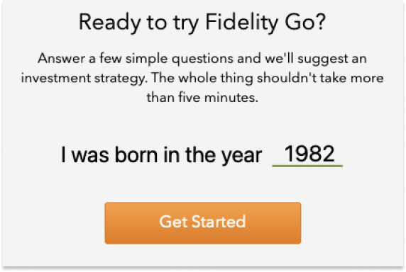
Surfacing the first profile question to the Landing Zone
RESULTSThe revised Landing Zone and new Quick Path Profile convincingly defeated the MVP experience by increasing Proposal generation by +8.2%. By making it easier to start and complete a profile, the downstream effect was more prospects becoming investors.
Profiling to Proposal
Landing Zone to Profiling
+8.2%ꜛ
+4.9%ꜛ
lift in views
lift in views

Percentage of MVP vs. Release 1 visitors