Nudging customers to save more
Using behavioral science to encourage maximizing customer’s retirement savings.
6 minute read
Project DetailsWhen: 2018
Span: 4 weeks
Where: Fidelity Investments
Role: UX Chapter Lead

My ContributionLead a generative design workshop
Contribute to design exploration
Provide creative direction to the Sr. Designer
Ensure activity was aligned to strategic objectives

What I hope you take awayHow I worked with product teams as a chapter lead
How I solve product challenges by focusing on customer outcomes
How I use behavioral science to design for action
BACKGROUNDAn individual retirement account, or “IRA”, is one of the primary ways Fidelity customers save for retirement. Conventional financial wisdom encourages every IRA owner to maximize their annual contribution, but most savers fail to do so.
CHALLENGEHow might we increase IRA contributions of existing customers?
SOLUTIONThe design process
Borrowing techniques from Google Ventures-style Design Sprints and Lean UX, with the fundamentals of human-centered design fully present: focus on user outcomes → explore → test → refine → measure → optimize.
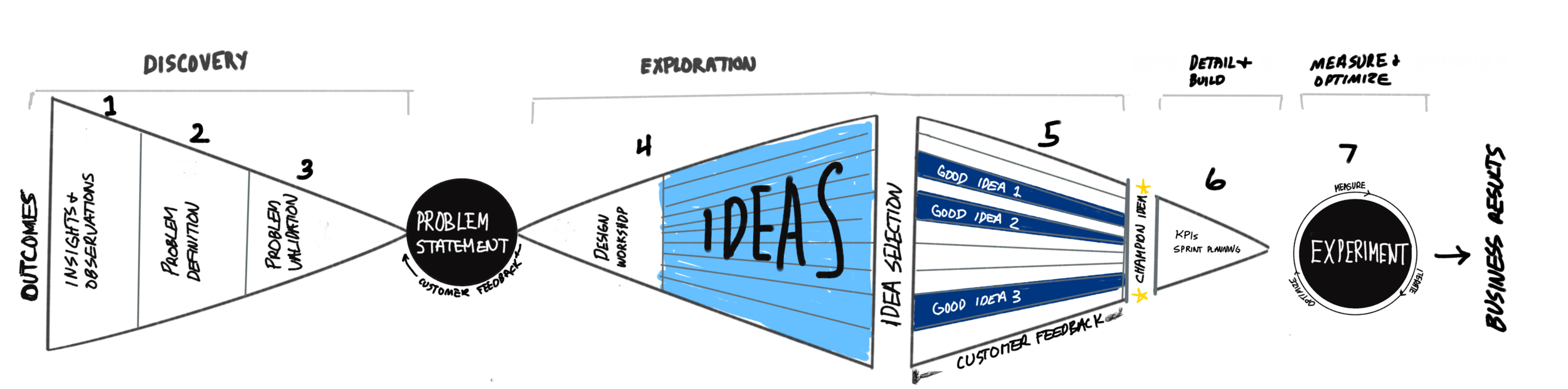
Overview of the design process followed
Problem Validation
Problem Definition
The first step was to identify and validate what was preventing customers from maximizing their IRA contributions. The team identified touchpoints, examined analytics, reviewed existing research, and took a peek at what our competitors were doing. Shortly, our definition of our problem began to take shape.
Leveraging UserTesting.com to run an unmoderated interview, we discovered that, while customers resonated with the problem statement, the overriding concern was uncertainty around how present-day contributions would translate to future income. So, we broadened the problem statement to capture that overarching concern.
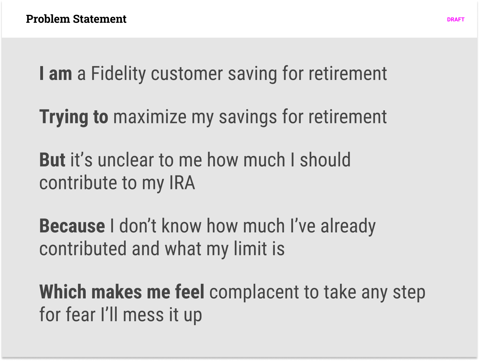
Draft problem statement
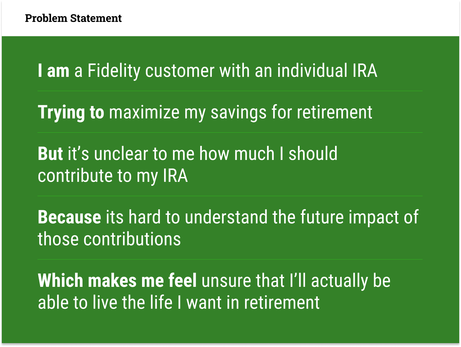
Revised problem statement
Idea Generation
We organized a 2-day design sprint workshop with the core team. Once everyone was grounded in the problem statement, we sketched possible solutions using Crazy 8s, essentially a time-limited sketching exercise where each participant produced 8 sketches within 8 minutes. From there, participants refined and presented their 3 best ideas. We then used a dot exercise, where participants mark the best solutions with a sticky paper dot, to surface the 3 most promising concepts.
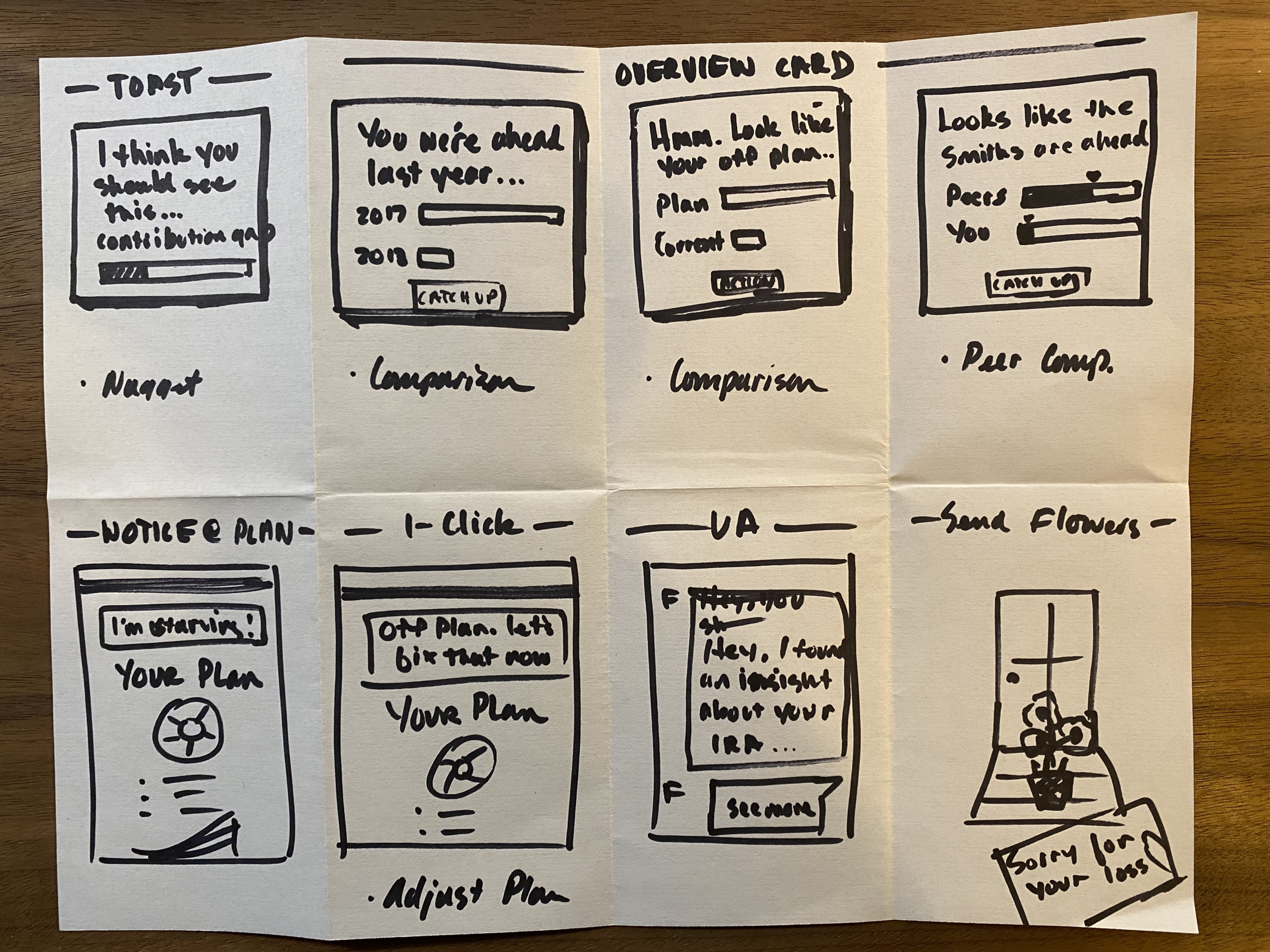
Crazy 8 sketches
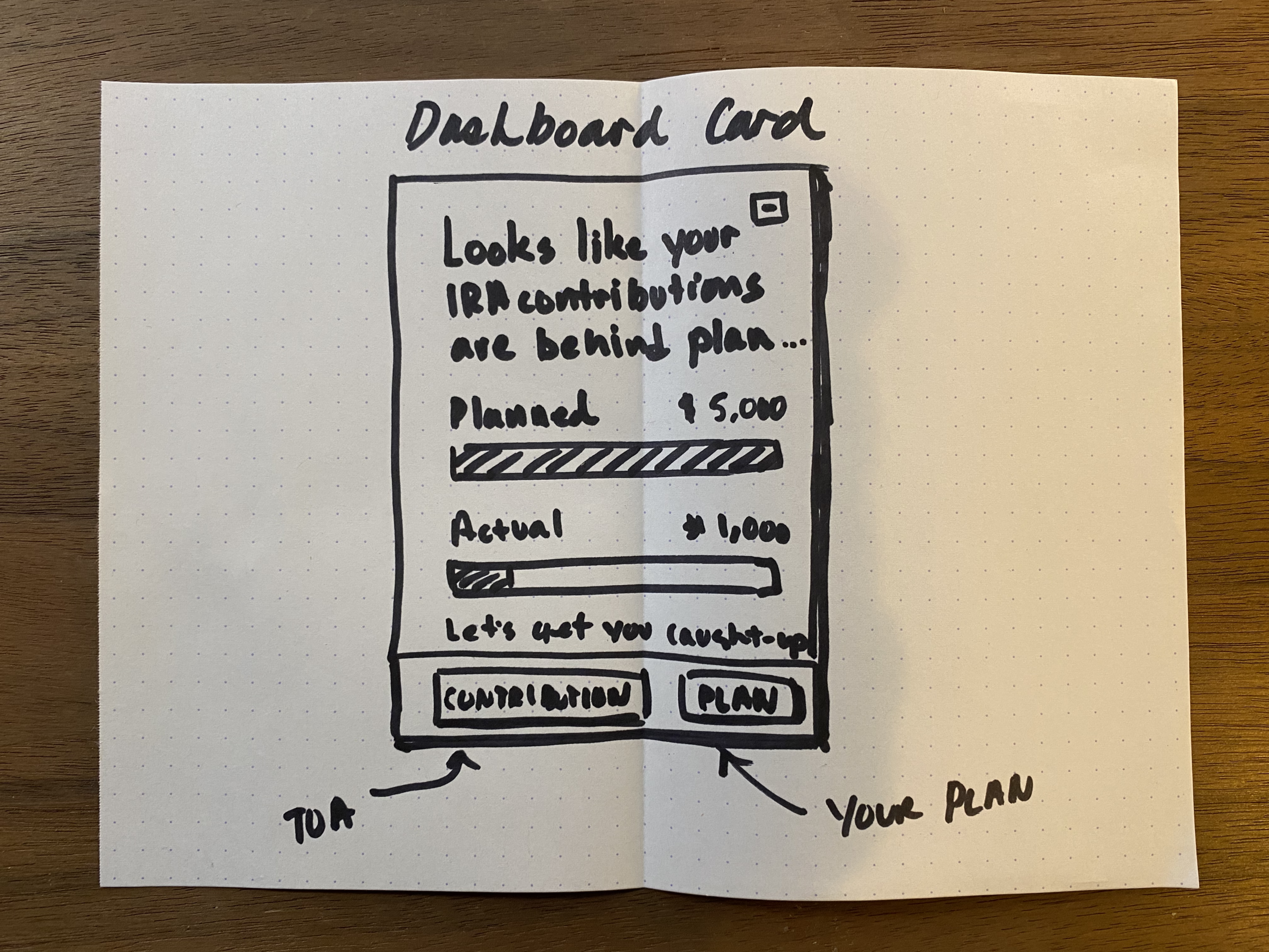
Idea Refinement
We invested more design and collaborated with a content writer to refine the concepts and put them in front of customers for feedback. Although a few participants commented on the “less than encouraging” language, we hypothesized that users may have grown numb to generic accolades such as “great job!” and may be more likely to take action if they fear missing out.
Refined concepts
Leaning heavily on behavioral science
Besides keeping the cognitive load small through minimal copy and simple visuals, below are key behavioral heuristics that influenced the design:
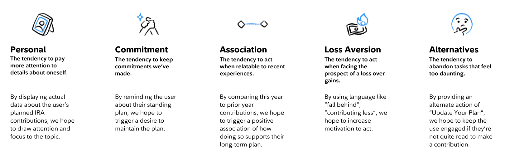
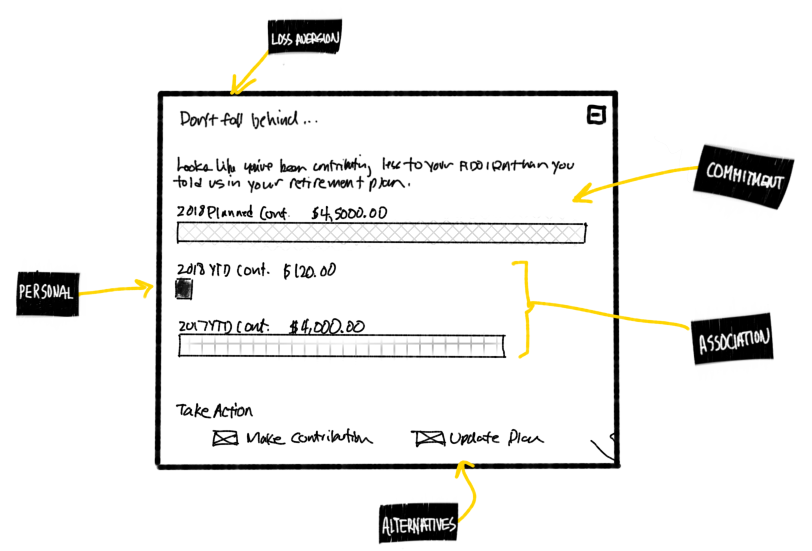
Where behavioral concepts appear in the design
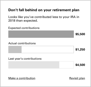
Detail design and build
Once we had a design candidate, the team went through their typical sprint planning process before starting work. Next, the squad’s Sr. Designer set to render the detailed design artifacts needed for production and worked with the developers through completion. Finally, after a wash and rinse through legal and compliance, we had a testable design.
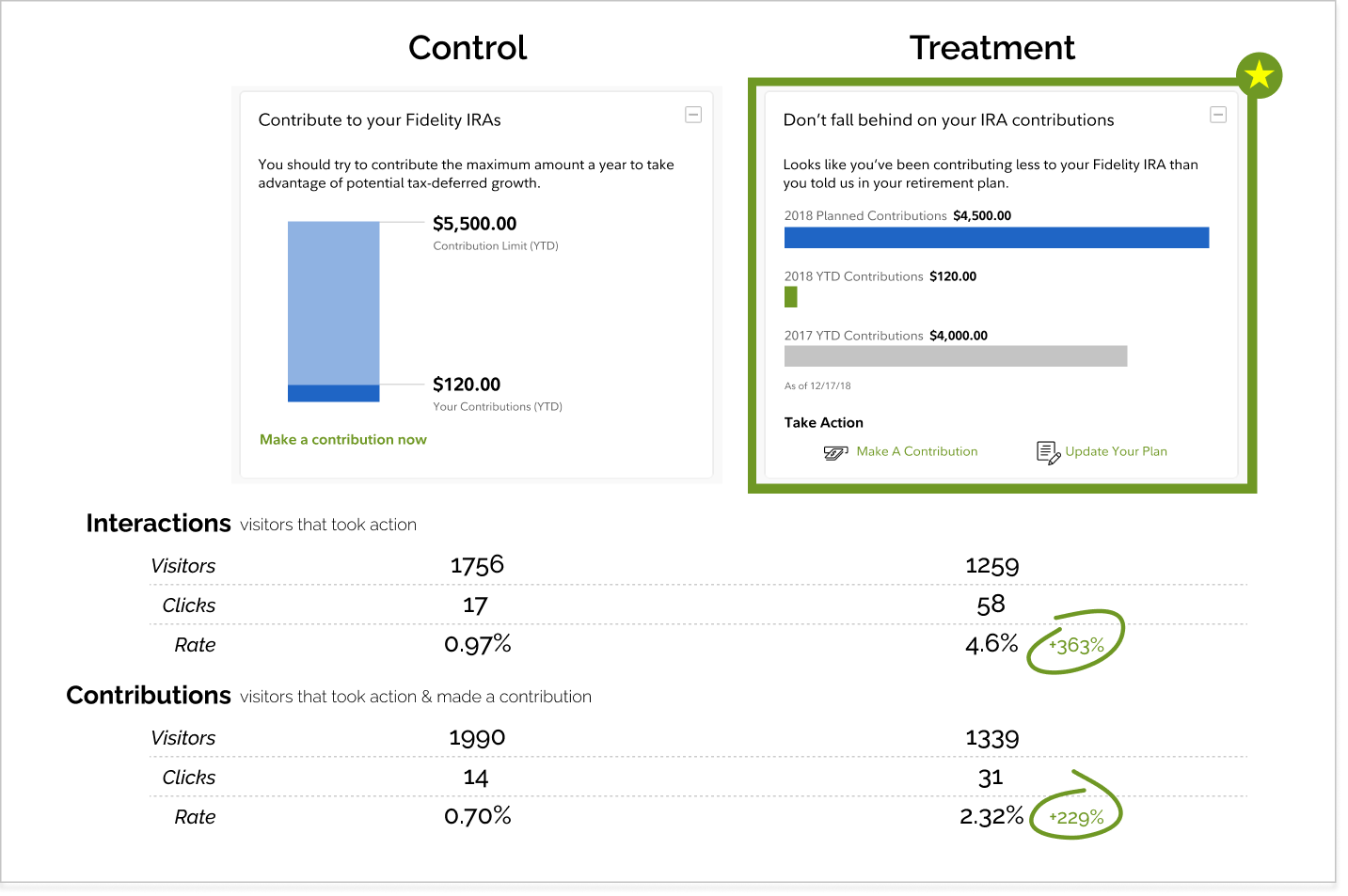
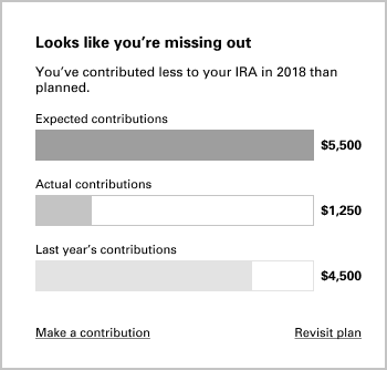
Incumbent
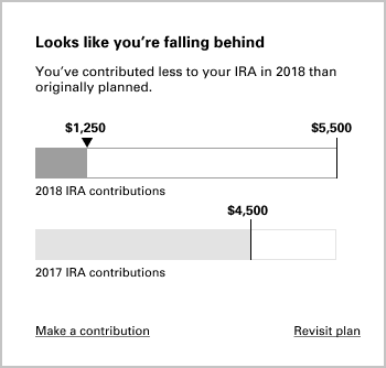
Challenger
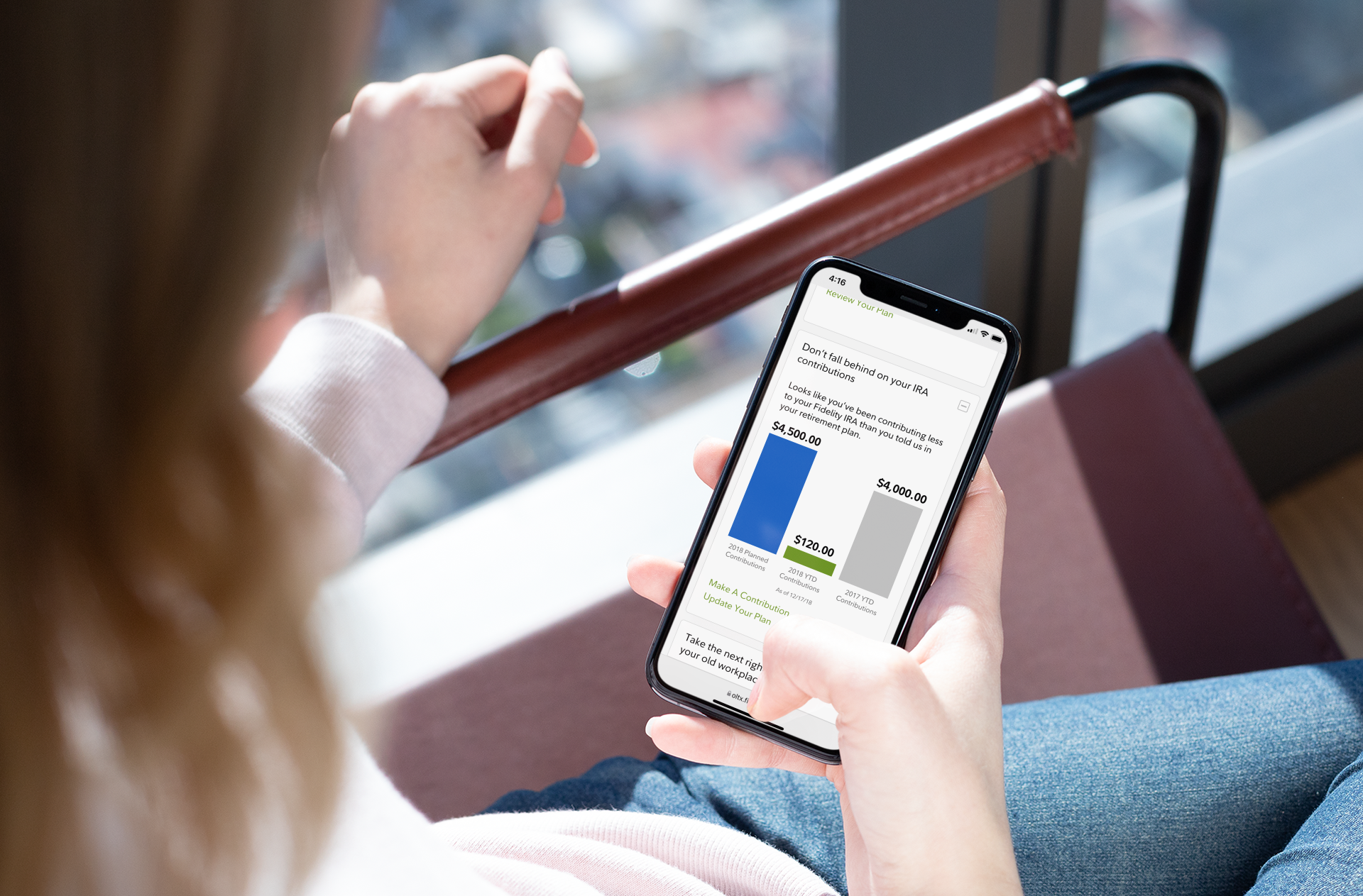
RESULTSMeasure
We then worked with our user research partners to formulate a test plan. Knowing that testing in the market renders more realistic customer sentiment, we elected to run an A/B test. The challenger/treatment exceeded expectations by handily defeating the control/incumbent. More importantly, customer’s IRA contributions grew significantly with the new design.
Contributions
+229%ꜛ
lift in contributions
Interactions
+363%ꜛ
lift in user interactions